
Pressed Wafer has little use for blurbs—too cliché ridden. But if they are o-la-la like John Ashbery’s for this book they are fine with us.
“Opening Ed Barrett’s Down New Utrecht Avenue is like happening on a mint-condition hitherto unknown set of chromolithograph baseball cards of an unimaginable rarity. Yes, but what do I do with them? You don’t have to do anything, the ‘unimaginable’ takes care of that. Just sit and let them wash over you pleasantly but firmly, like ‘a three-game series raveling and unraveling the hajj of things drifting through you.’”
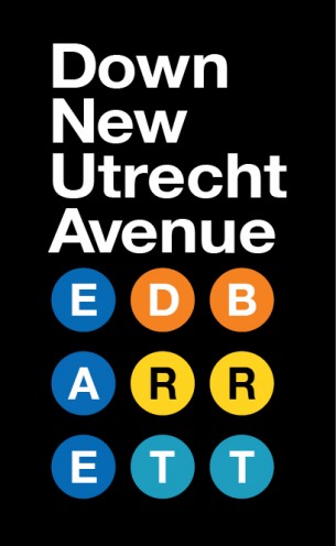
For this book’s cover Michael Russem made excellent use of Helvetica, the typeface of New York’s MTA.